Liliantine, Sword of Eris - Part 1
Tackling an excellent study piece from Arnau Lazaro Miniatures
Introduction
Packaging
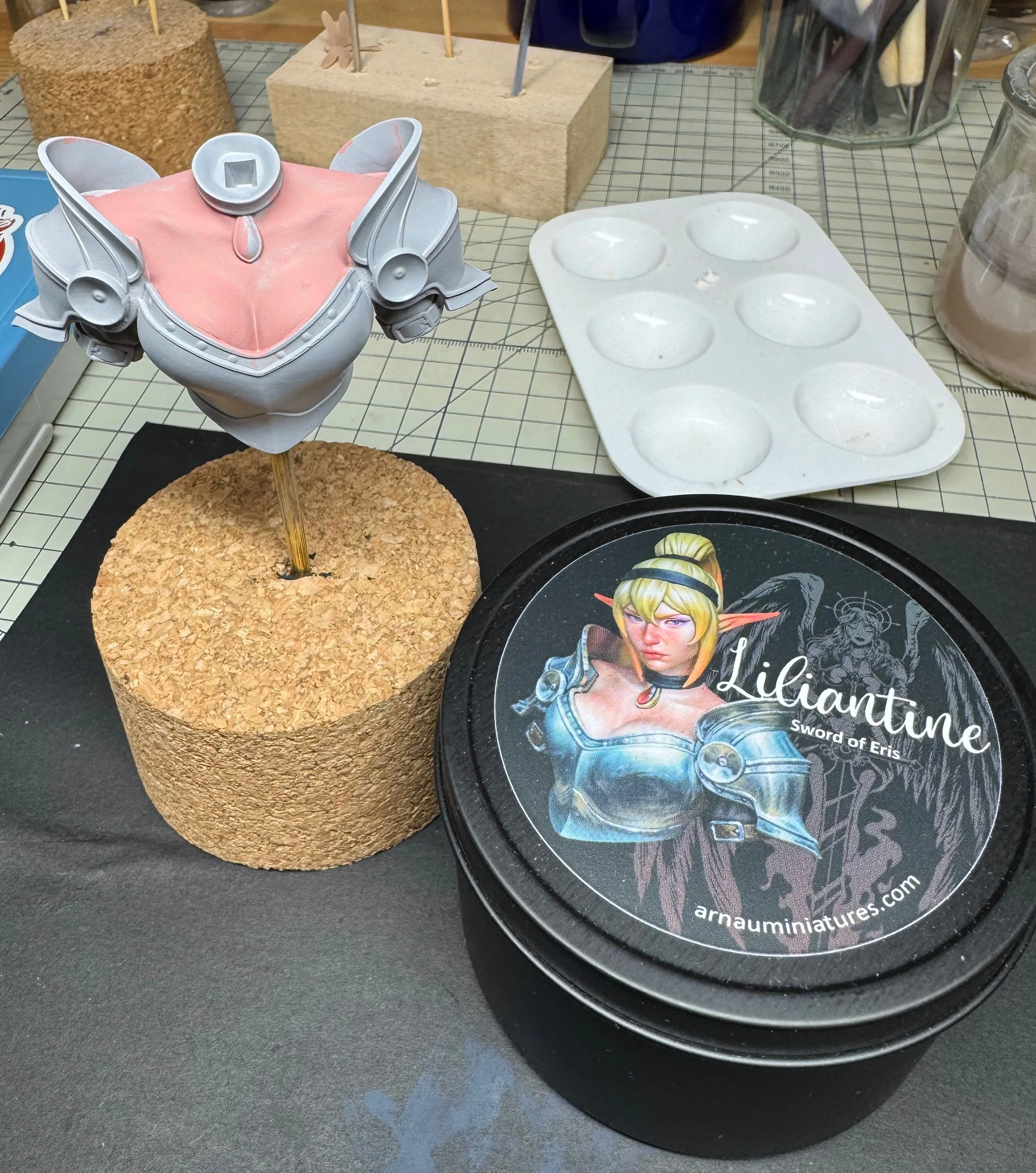
The bust comes in a nice little tin. Arnau’s beautiful box-art is printed on the cover.
I’m not a newbie. I’ve been painting figures and busts in both the historical and fantasy genres for a very long time. Over that time, I’ve really sought to hone my skills across a myriad of advanced techniques – from non-metal metallic (NMM) techniques to directional and object-sourced lighting (OSL) approaches, to simply mastering flesh tone painting. With all that time spent honing my craft, the key lesson I’ve learned is that you can never get enough practice. Small study pieces might seem less complex or desirable, but I think they present some of the best learning opportunities for figure painters of all skill levels.
When I came across Arnau Lazaro’s excellent NMM study piece – Liliantine, the Sword of Erris – I just had to give it a go. The piece is a regular teaching tool in his painting workshops, providing not only some great NMM armor to tackle, but also a wonderfully sculpted female face. The figure’s hair and small jewel around her neck provide even more challenges for the painter to tackle.
All of these are elements I’ve worked hard to master, but I wanted to see if I could replicate his version of the box-art as closely as possible. Master painter Eric Swinson once told me that’s a great way to develop your technique – copying a particular work and trying to understand the reasoning behind the choices made. Besides, sometimes seeing someone else’s version of a particular piece is the spark that gets you inspired to make it your own.
OK, let’s take a look.
The kit – assembly, prep and painting strategy
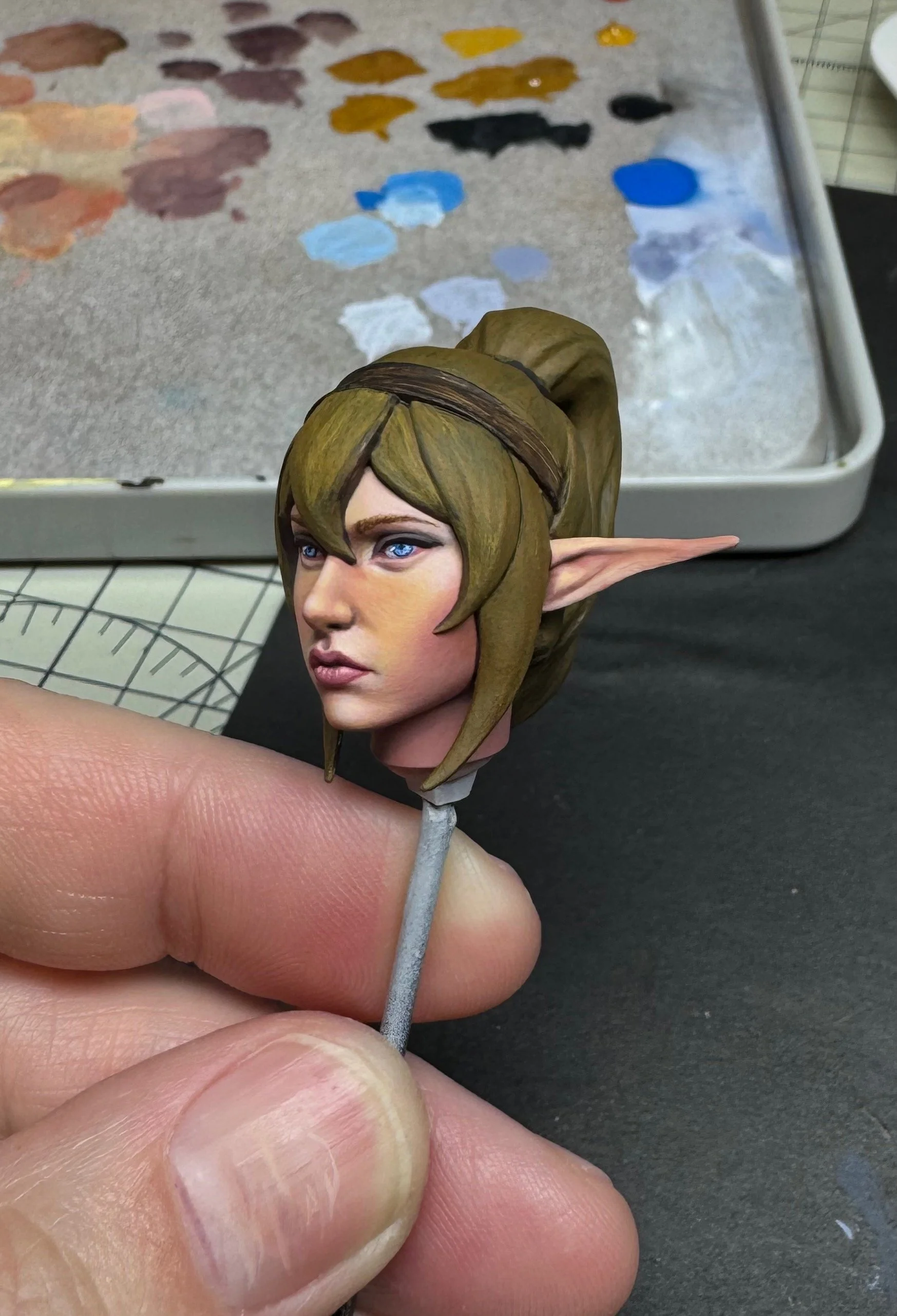
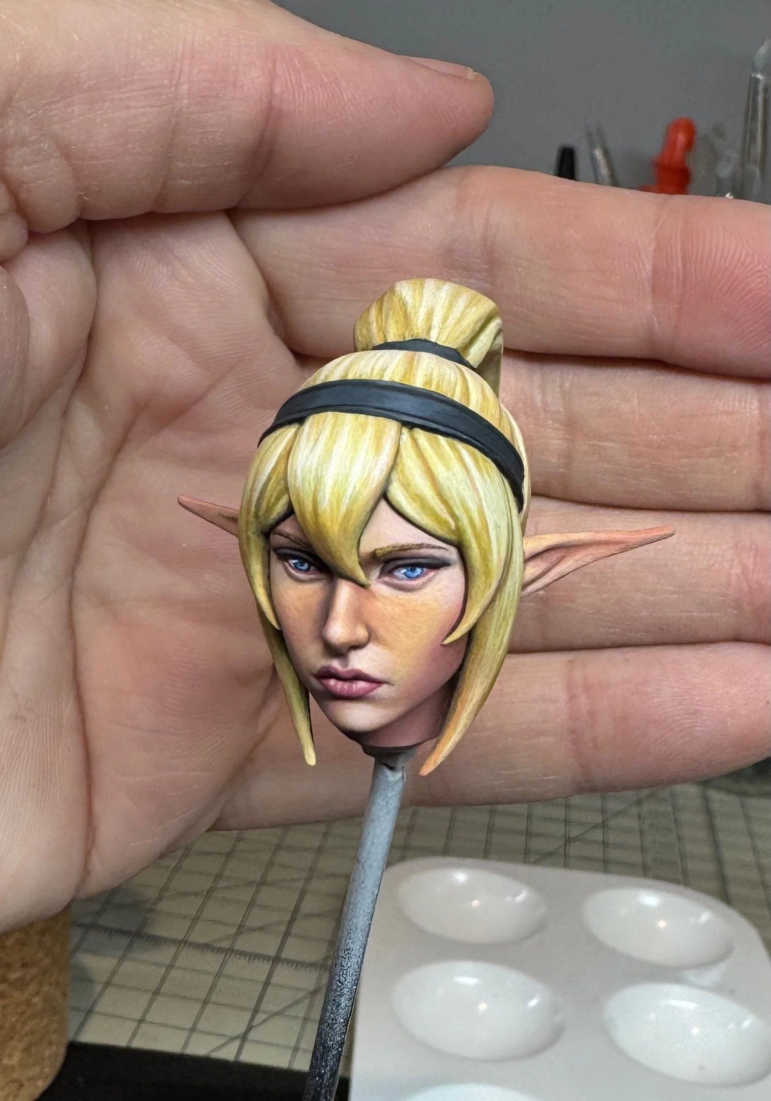
She arrives in a lovely tin, which was a little different than most boxed pieces. The unboxed model comes in 3 pieces – the armored torso and neck are molded together, with the head and ponytail left unattached and easy to paint. The features and details are crisply defined and begging to be painted.
My usual approach is to affix the primary bust to a hollow copper or aluminum rod, which allows me to handle the figure a little more freely and will ultimately attach the piece to its plinth. I do this by drilling a small hole in the bottom of the resin casting. I drilled small pilot holes in the base of the head and affixed the ponytail to the back of the hairline, filling the small gap with bit of Vallejo Plastic Putty. I then pinned the head to a small painting dowel. This allowed me to prime (using Mr. Surfacer 1000) and paint each piece independently prior to final assembly.
I began the painting process in my typical way – applying a base coat of flesh tone using Scale 75 Pink Flesh acrylic over all the exposed skin areas. In this case, that was the upper chest of the torso (she has an ample exposed bossom), along with the separate head. I usually apply this base color using an airbrush as the smooth surface provides a nice surface to begin laying in color. However, given the relatively small size of the piece I decided to do this in 2 thinned layers of the Artist Acrylic (tube) line from a wet pallet.
The hair was base coated in a similar fashion using Scale 75 Burnt Umber. For the armored areas, I blocked in using Green Grey – which I think provides a nice off-black base for the darkest areas of the steel armor. As we continue, note that all colors I reference are Scale 75 artist acrylics.
Painting the face
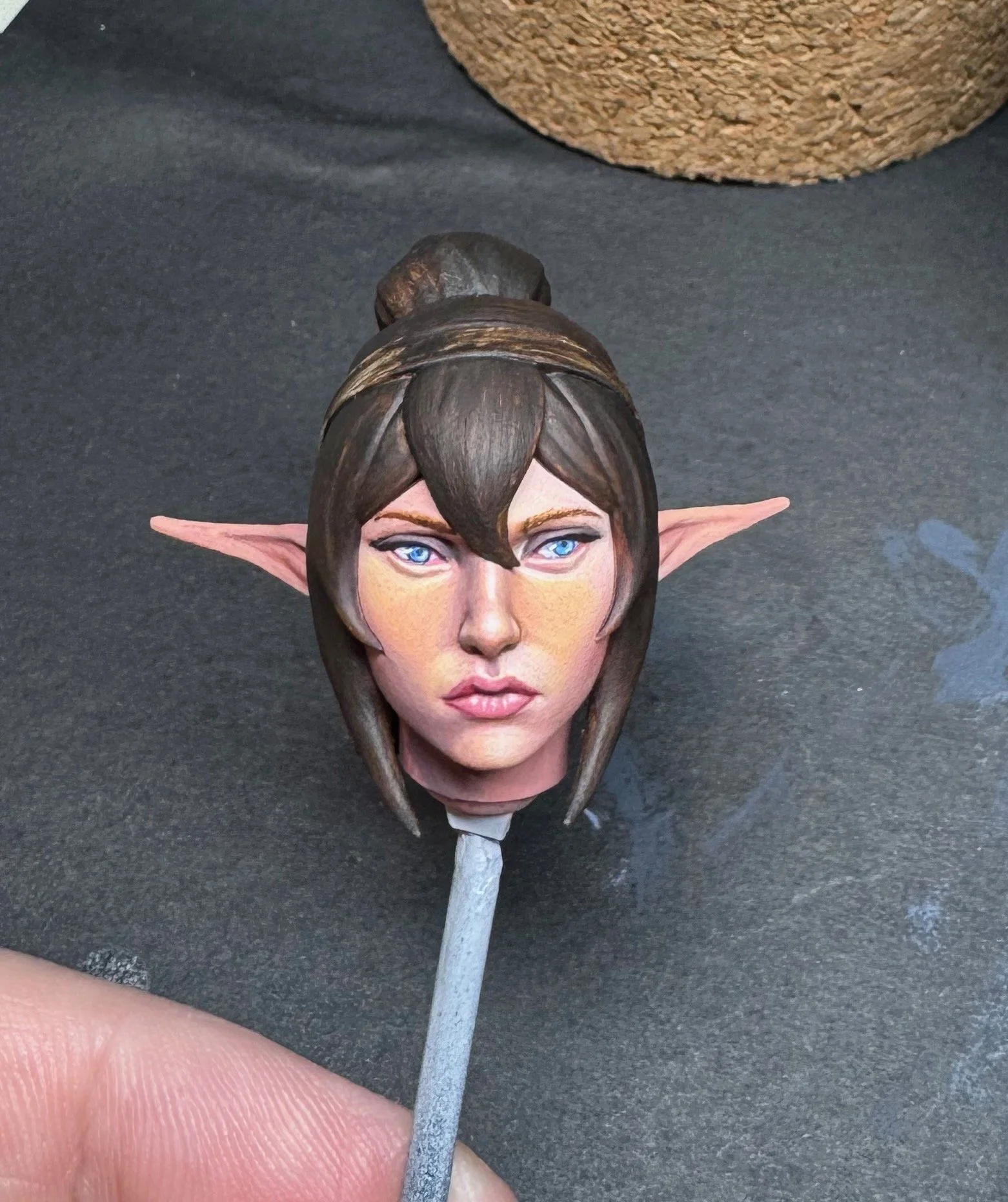
With the base-coating complete, I began by focusing on Liliantine’s face. For almost any figure I paint, I’ve found that starting on the face – and getting it right – will help propel me throughout the rest of the painting process to finish the balance of the figure. With this piece, that would be the simplest task, as the primary aspect of the figure is really the NMM armor. That being said, the sculpt here is truly wonderful, so I wanted to do it justice.
I began to sketch in the initial tones of the face. For me, a face typically takes shape over 1-2 sessions, focusing initially on getting the base highlights and shadows in place. The Pink Flesh is a great middle tone, allowing me to apply layers of highlight using Pink Flesh + Golden Flesh, then pure golden Flesh, and finally the lightest highlights by adding in Light Flesh. Shadows took shape using Golden Flesh + Burnt Flesh + Crimson for the first pass, then deepening these with Pink Flesh + Crimson + Moss Green. Finally, I created some deeper tonal variety on the shadows by blending in Dark Brown Ochre, which added a subtle purplish hue when mixed with the Pink Flesh.
Particular attention was paid to overall lighting during this step, as everything else will build from here. From the box-art I was trying to emulate, the front of the figure seemed to be basked in a zenithal light slightly forward of the figure. I moved this slightly to the right, which allowed me to add a bit of right to left directional lighting. This also resulted in most the figure’s back to be in some degree of shadow.
Along the way, I brought out detail elements like the eye sockets, the nose / nostrils and the general shape of the mouth and lips. Adding Crimson to the darker Pink Flesh shadow mixture creates a nice dark reddish pink tone, which I used for the base of the lips and in the corners of the eye socket to simulate the lacrimal gland. For my darkest areas of shadow – under the chin and the interior nostrils – I used a blend of Crimson + Moss Green, which creates a dark reddish brown which can be easily modulated to be more red or green depending on the blend.
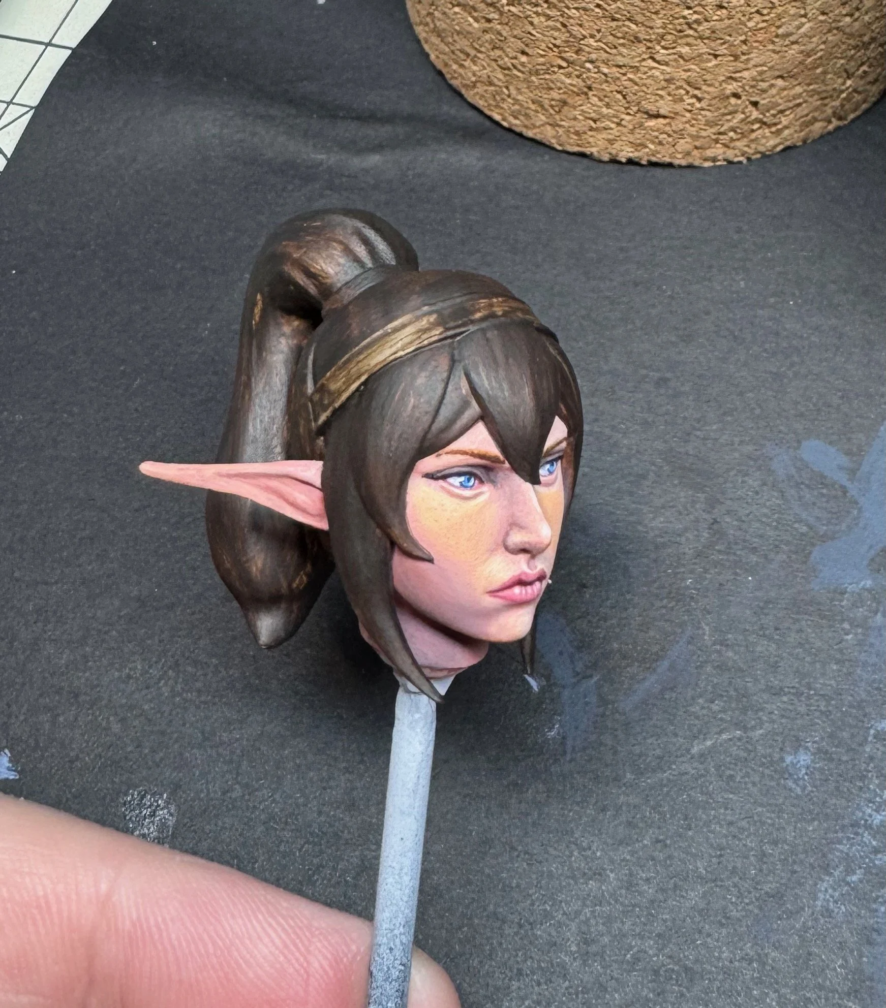
As you can see, I made it far along in my first session. I was able to complete the initial work on the eyes, as well. I paint in the whites of the eyeball using a blend of Violet + Pearl Grey and then cut in the outline of the Iris using Green Grey. With the head tilt in the sculpt, I wanted her to be looking at something off to her left.
Over this I mix a darker + lighter shade of the eye color – in this case bright blue – and add dots of varying color within the outer edge of the iris to give some depth and complexity, while leaving a darker area in the center for the pupil. As a final touch, I add light glints along the left side of the pupil using Art White. This really brings her to life.
With the eyes in place, I begin to color the hairline using burnt flesh. Using this same color, I add in the general shape eyebrows and further refine highlights and shadows to help bring out the finer contours of the face. I’m keeping the overall lighting scheme in mind at each step. Shadows are accentuated under the chin, and along the recesses under the nose. I added subtle directional lighting to the side of the nose and lower cheek. Highlights are added under the eyes and along the nose where they would catch the zenithal light above.
Next came a subtle application of makeup. I added a little smoky shading to the eyelids using Dark Brown Ochre. Lashes were darkened using Burnt Umber along the upper eyelid, with detailed lashes applied individually on the lower lid. I applied some light rouge to the cheekbones using a thinned wash of pure Crimson. I also refined the eyebrows using Burnt Flesh + Burnt Umber. The lips were detailed with a mixture of Pink Flesh + Crimson, and highlights added with thinned layers of Light Flesh.
The final touch was to detail the ears. These were done using the same basic tones of the face, with highlights and shadows that conformed to the overall lighting scheme.
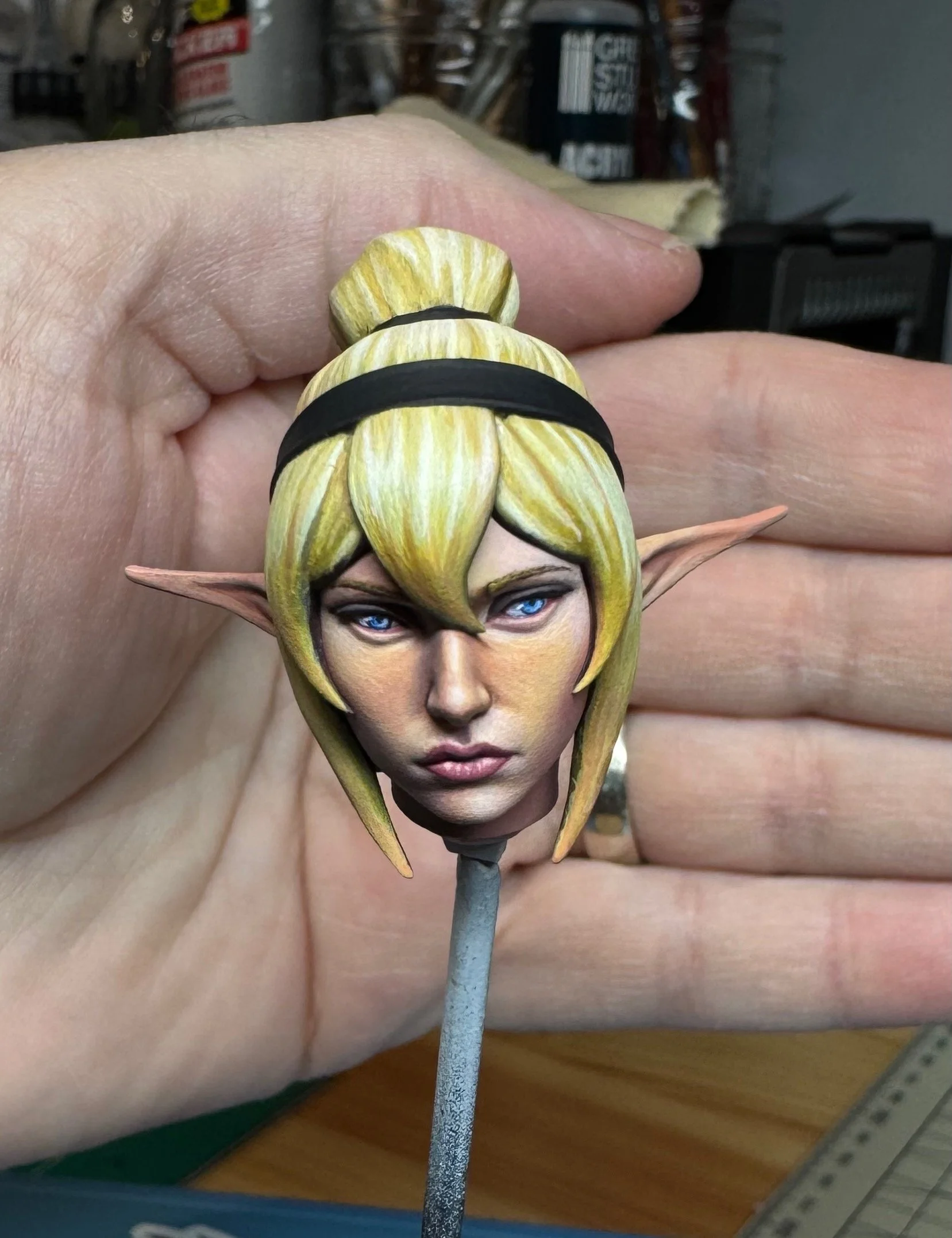
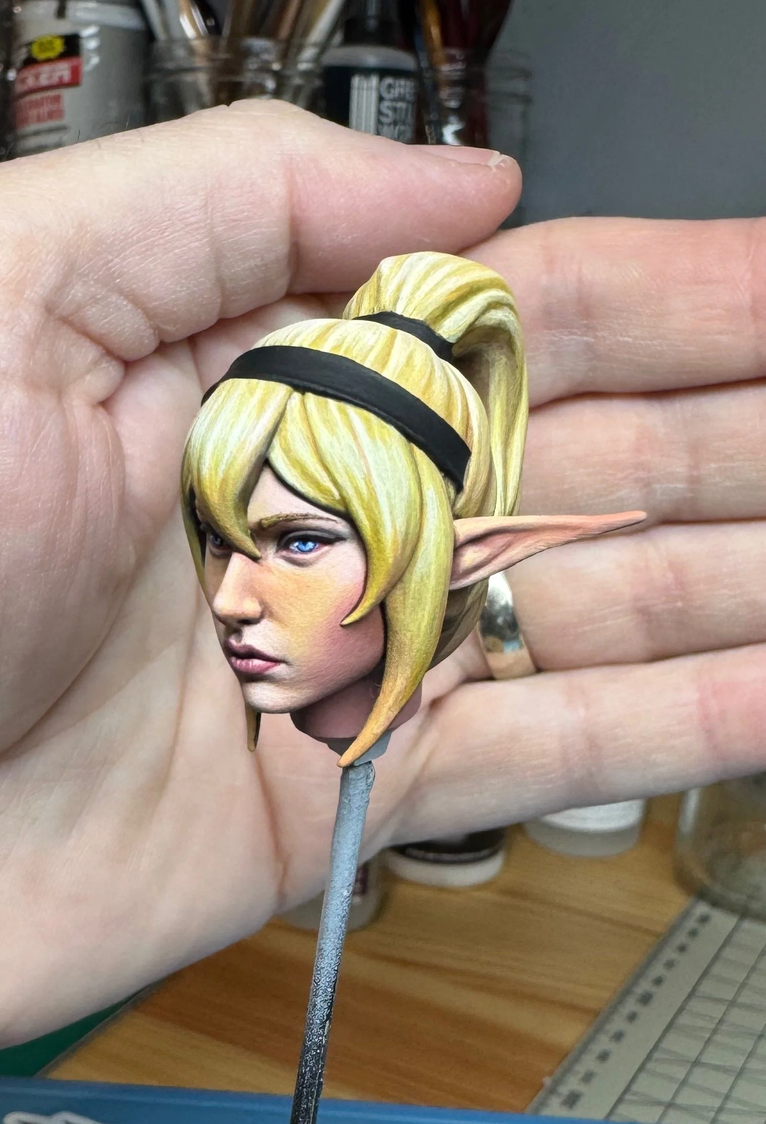
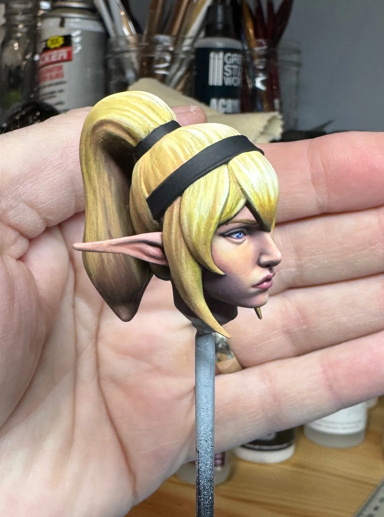
Painting the hair
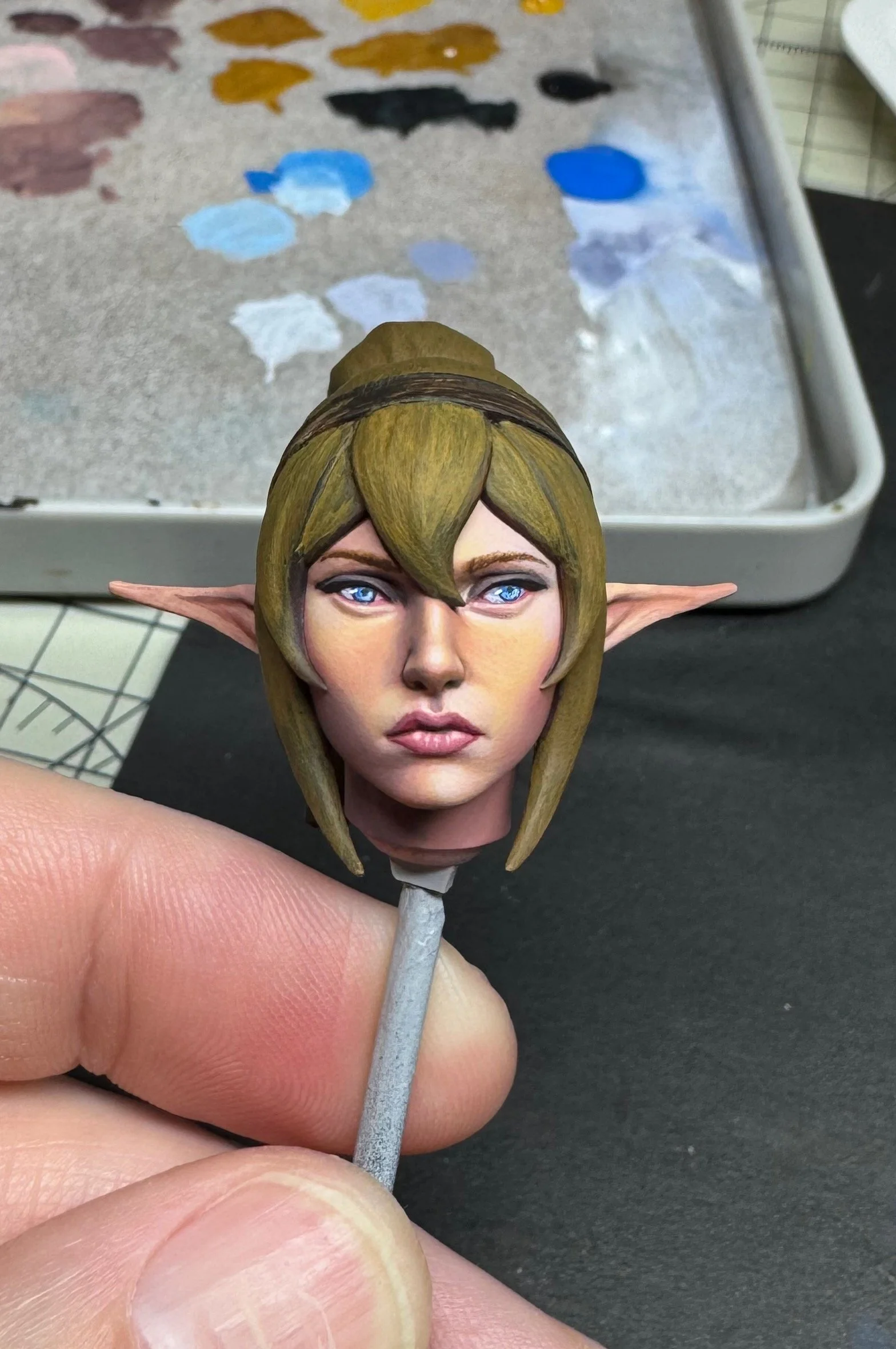
With the face near completion, I began to tackle the hair. I really liked the bright golden color from the box art, so I just went with it. Over the base coat of Burnt Umber, I laid in an initial base tone of Yellow Ochre. This gave me a nice mustardy yellow color, over which I continued to build up layers of highlight.
First came an application of Naples Yellow. I added in highlight areas by mixing in Vanilla Yellow, then Vanilla White. The result was a little hot, so I toned it down a bit by blending in more Yellow Ochre, and even a bit of Burnt Sienna along the shadowed areas. I played with mixes of highlight and shadow until I achieved the desired result.
As a final step, I used a thin wash of Vanilla White to help accentuate the highlight / reflection on the top tresses of hair and a wash of Orange along the transitions from bright to dark to help modulate the tones.
The hair band and ponytail tie were painted in a subtle off-black tone, so as not to distract or compete with the brightness of the hair. I base coated these in Green Grey, then built up subtle highlights by mixing in degrees of Violet Grey. The brightest of these was along the top right edge of both elements.
In our next post, we’ll tackle painting the torso and the NMM. Stay tuned!