Liliantine, Sword of Eris - Part 2
Tackling the torso and NMM
Painting the upper chest area
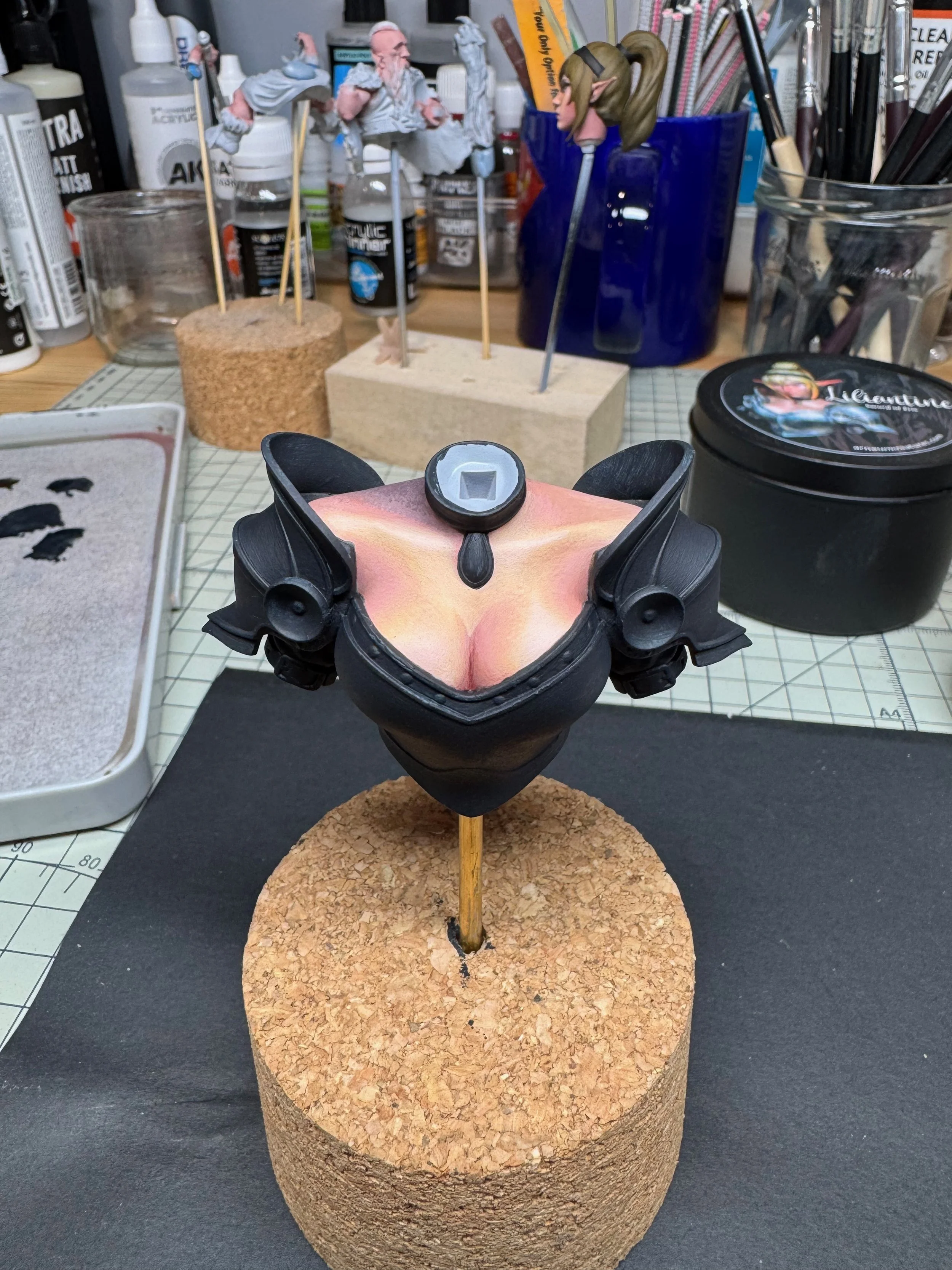
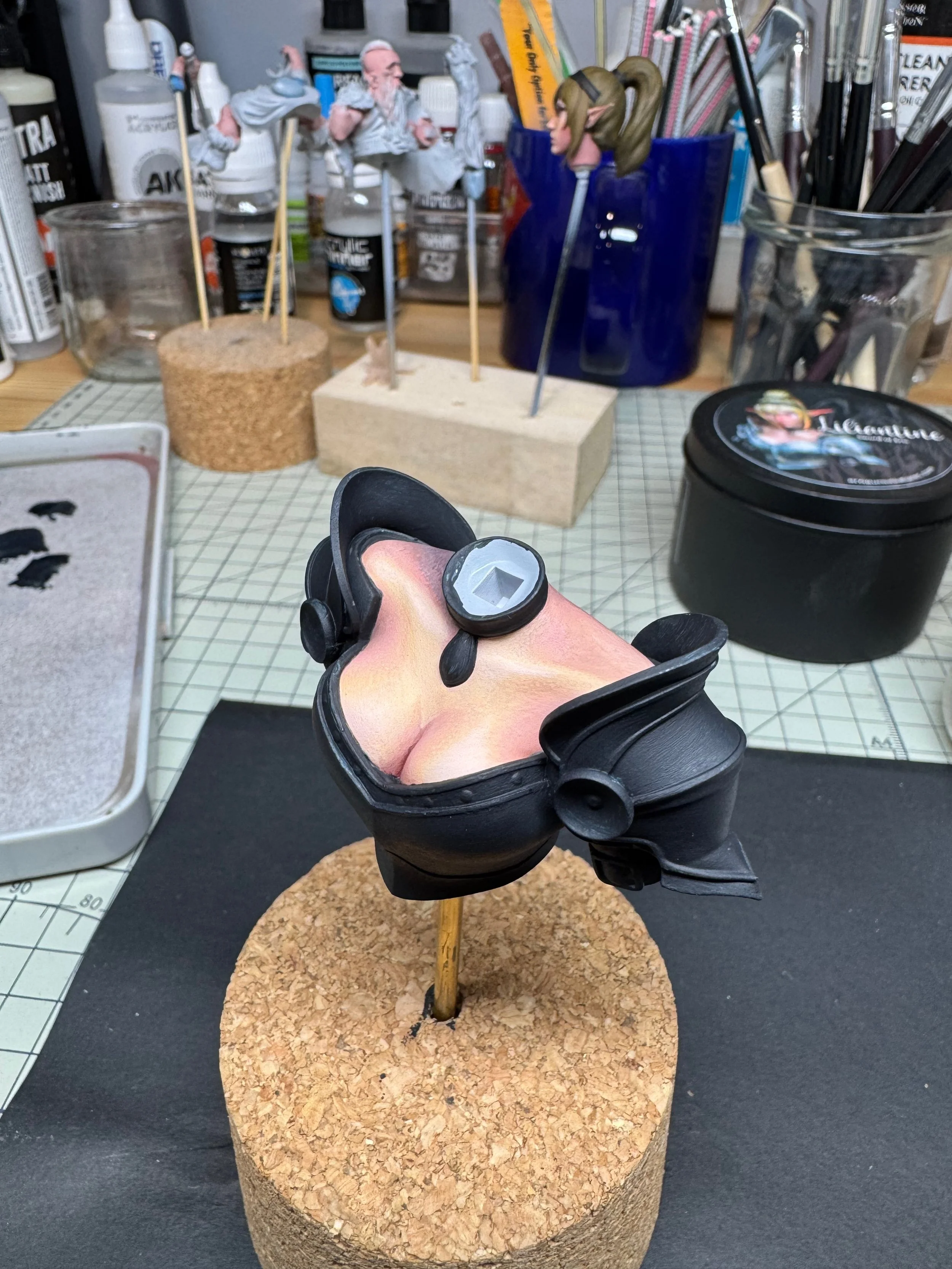
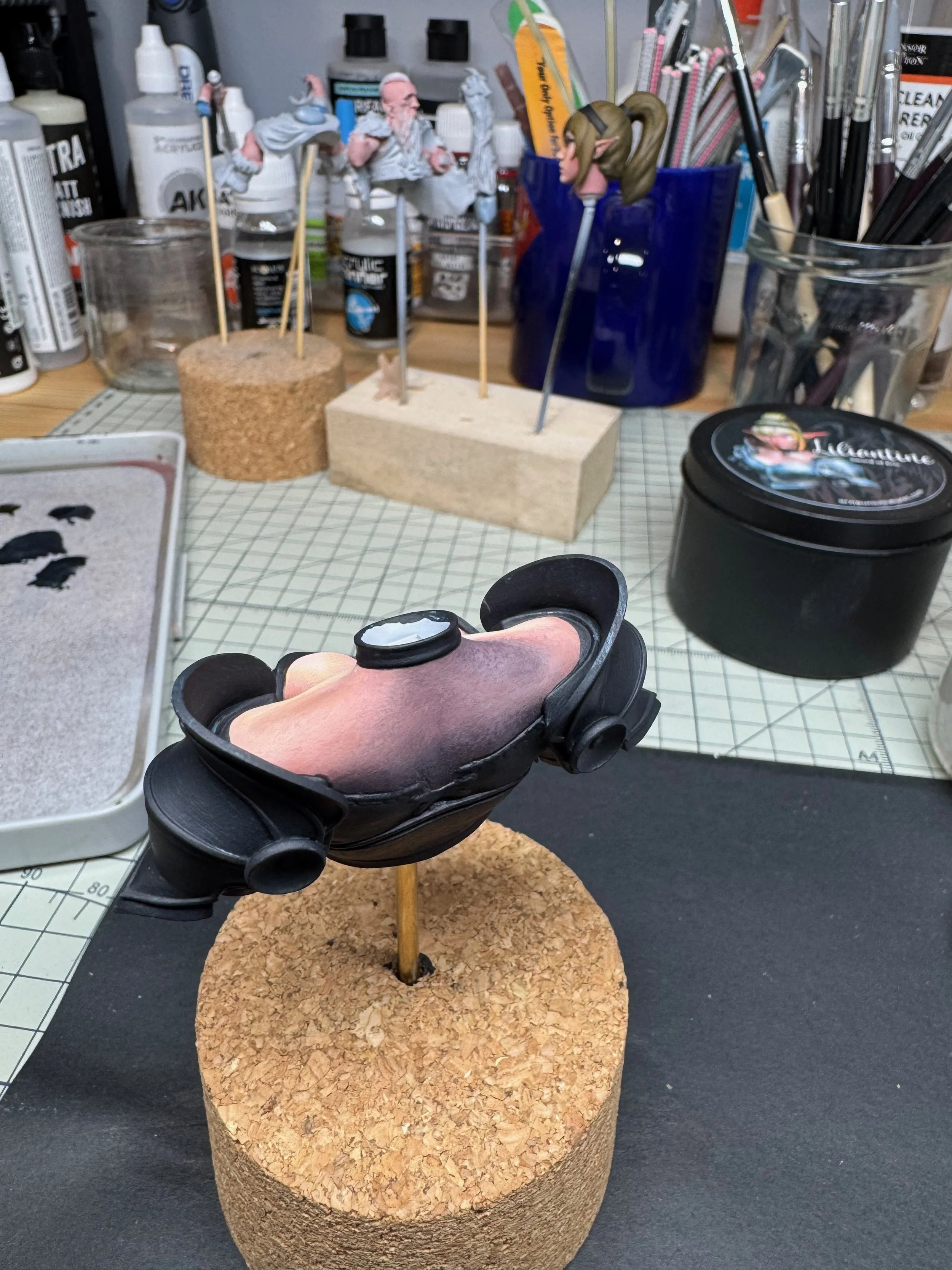
With the head near complete, I began moving onto the torso. The flesh areas along the top had to be painted to blend with the tones of the face, carrying the overall zenithal lighting scheme from top to bottom / right to left.
I decided the areas of brightest highlight would be the exposed bosom and collar bone. Around these areas I would build graduated shadows that wrapped around her features from top to bottom, with the darkest areas being the cleavage and crossing the neck to the left and down to her lower back.
I began the process in much the same way I tackled the face – sketching in the areas of light and shadow over the Pink Flesh base. I moved top to bottom with each pass of the sketching process until I had a rough idea of how the colors would flow across the chest. In time, the harder edged sketching became areas of subtle transition.
The overall transition scheme applied through the process was as follows: Light Flesh > Golden Flesh > Golden Flesh + Pink Flesh > Pink Flesh > Golden Flesh + Burnt Flesh + Crimson > Pink Flesh + Burnt Flesh > Crimson + Moss Green. Along the way, I added in glazes of Dark Brown Ochre to help modulate the tones.
Tackling the NMM
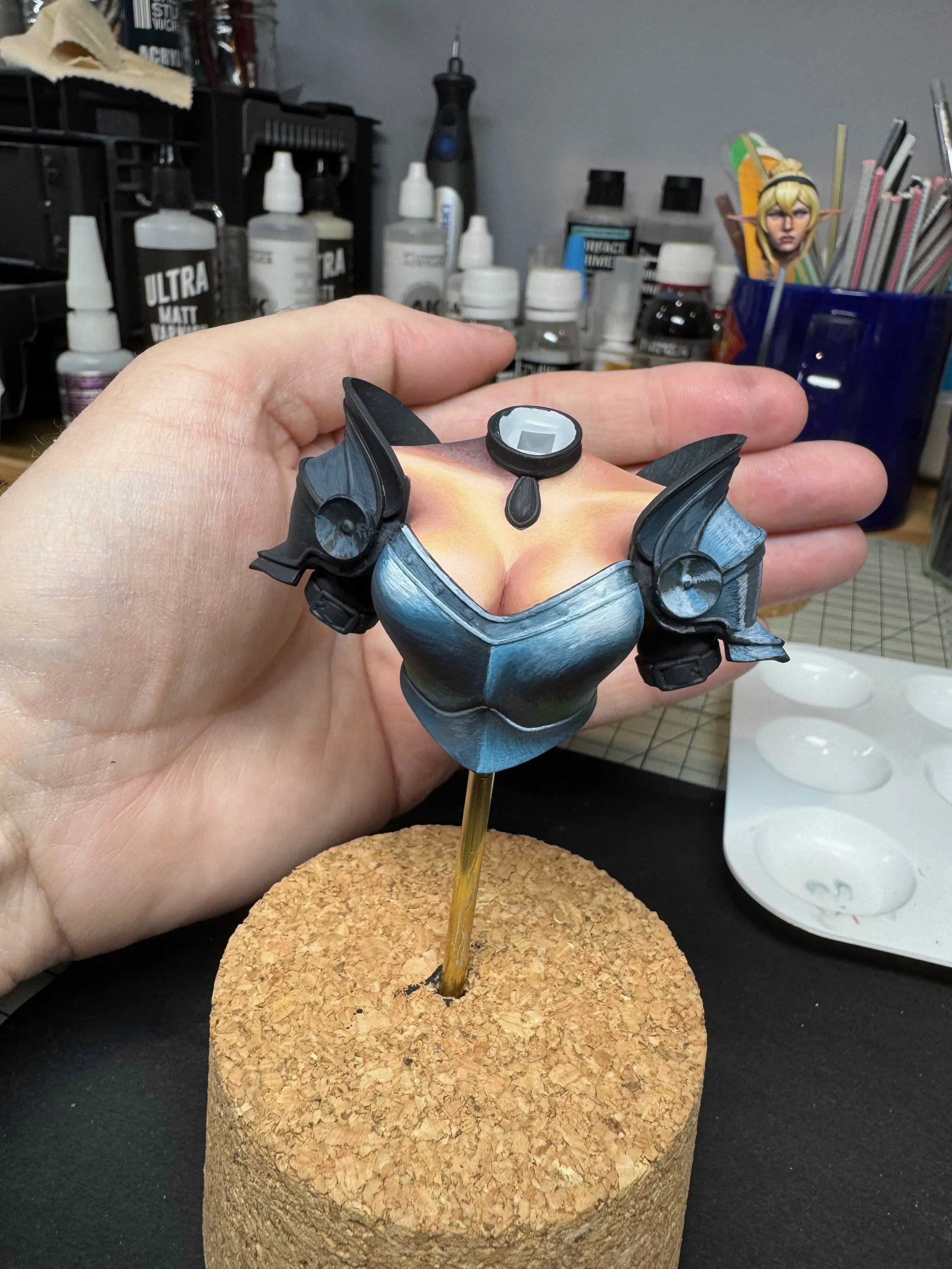
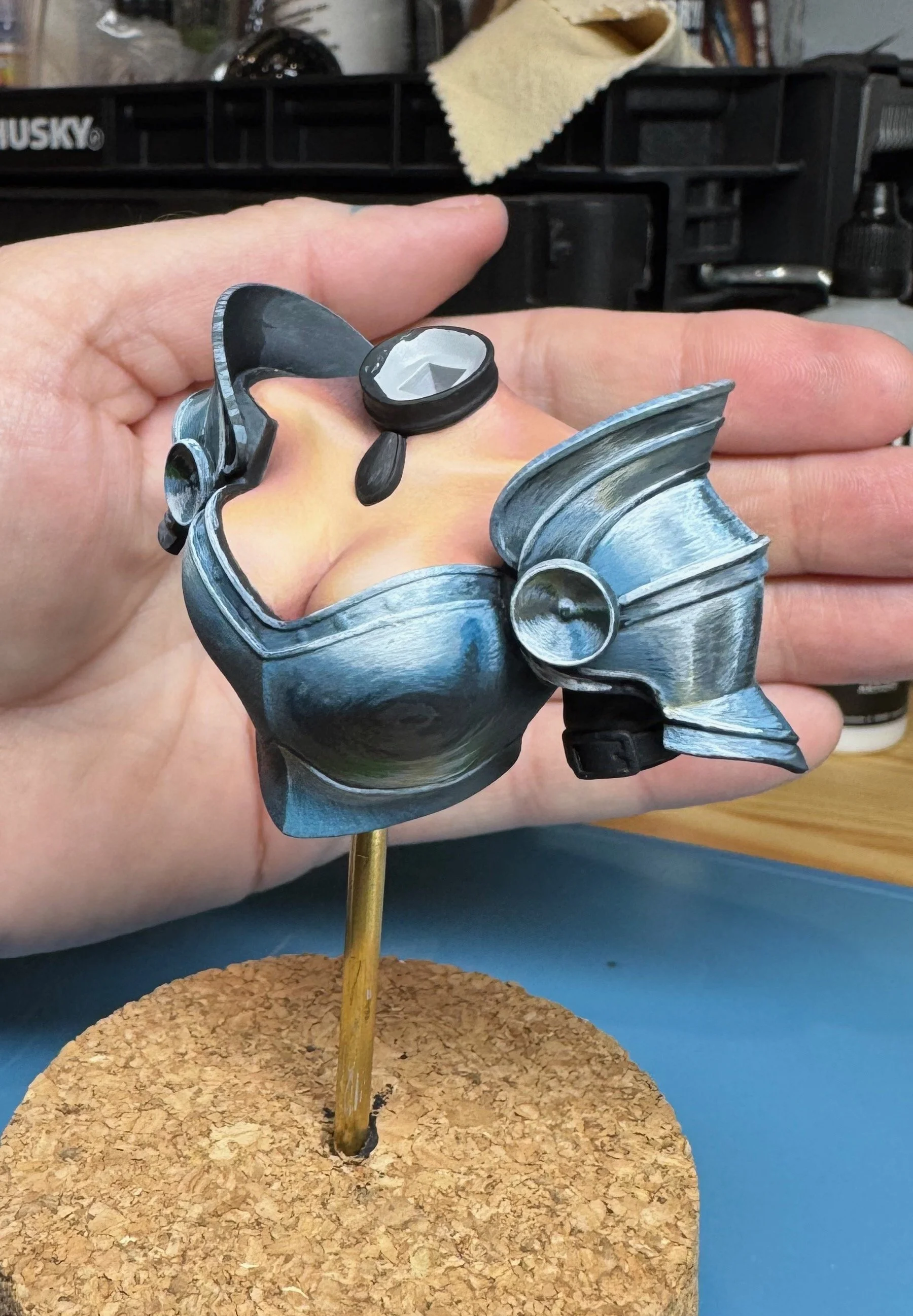
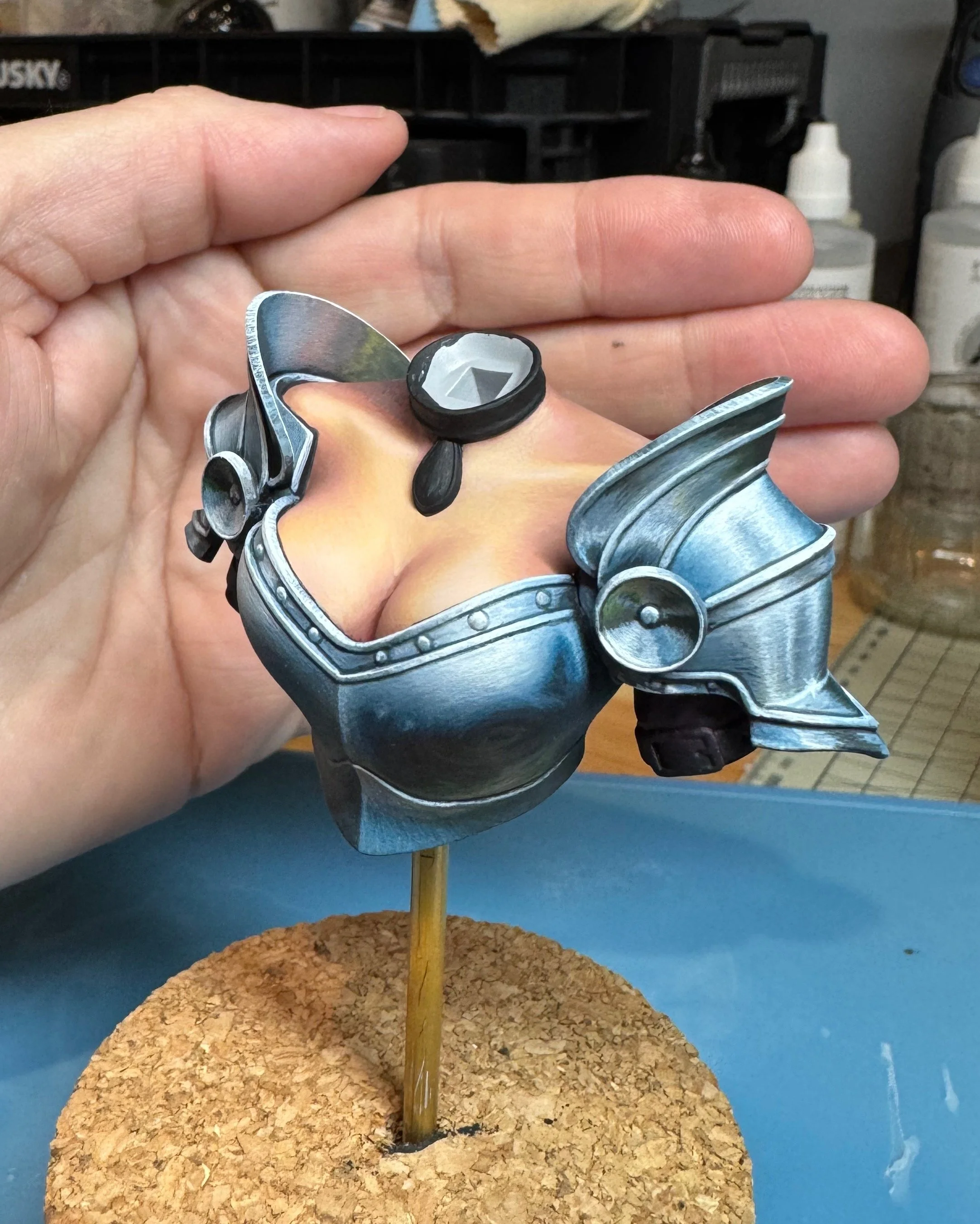
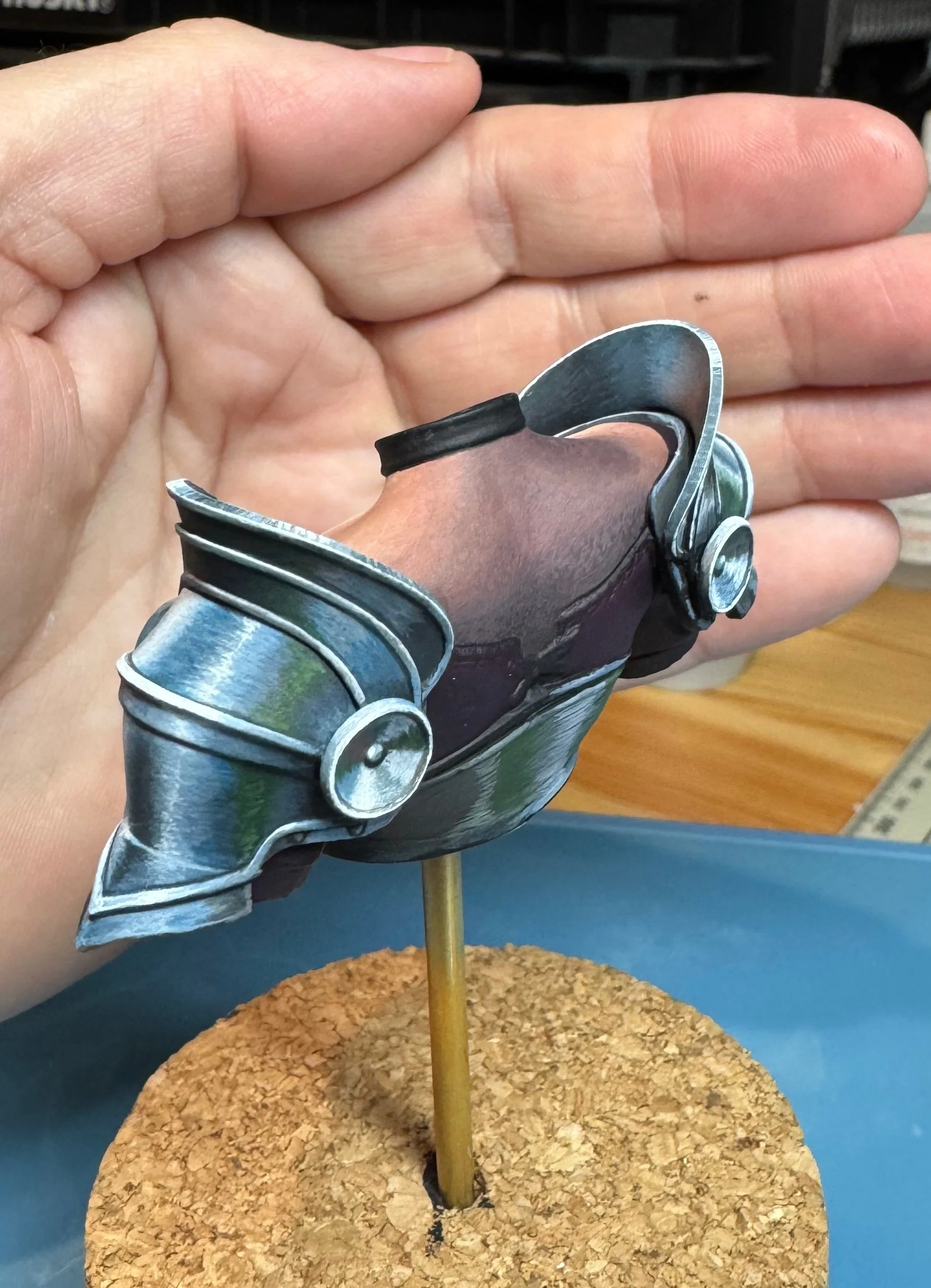
The last major element to finalize – and the primary element of this piece – is the NMM armor. From experience, I knew that successful NMM technique relies on maximizing contrast between the reflective and specular lighting (glints) with dark shadows and the base tone of the metal surface. Arnau’s box-art presented a masterful execution to work from – but from a single vantage point.
While I planned on the brightest reflections / highlights coming from the upper right zenithal light I would still need to add in ambient light and reflections of surrounding elements across the entire piece. This required a bit of imagination in the concepting phase to address the questions that will arise as you execute the painting process … What color is the sky she’s under? Are there buildings around her? How about trees? Each of these elements will need to be worked into the reflective surfaces in some fashion to achieve a believable NMM result.
We must also consider the metal finish we are trying to simulate … is it a highly polished, mirror-like finish? Or is it the armor older and battle worn, with scratches marring the surface? I reviewed images of period armor taken from museums as well as recent replica armor made for film / reenactors / cosplay. As usual, Pinterest in full of great reference material to work from.
I began by sketching in mid-tones and highlights by blending in Pastel Blue + Arctic Blue to the Green Grey base color. I worked from the middle breast plate out in both directions. Each element had to be approached as a unique volume while conforming as much as possible to the unified lighting scheme. As the breast plate consist of rounded bowl-shaped pieces I tried to tackle the execution in a spherical fashion, with the upper portion of the sphere more in light and the lower half more in shadow.
The lower abdominal protector does this in reverse, catching the light of the sky again as it moves back out from the torso. The edges of the various armor segments are outlined in dark color and then highlighted along the upper edges where they’d catch the light. This helps give them dimension and strengthen the overall illusion.
The upper and lower plates of the shoulder pauldrons were treated slightly different, with vertical bands of highlight and shadow. Areas that directionally point toward the ground are considered to be more in shadow, while the areas that point towards the sky or out to the landscape beyond receive more reflective highlight.
The circular rondels were painted to resemble bands of highlight / shadow that radiate from center out. Once again, the volume areas that point down receive more bands of shadow and reflected ground color while the areas pointing upward receive brighter highlight mixed with reflected blue from the sky above. I used a thing glaze of Prussian Blue to help modulate between the Green Grey and Pastel blue reflected light.
I also had to paint in the reflections that would be on the inside of the plates that rise from the top edge of the pauldrons. These would reflect skin tones and the yellow of her hair, so those colors had to be subtly added.
Along the way, I added in washes of Moss Green to imply trees in the background and Cork Brown along the lower rim of the breast plates to simulate reflected groundwork. I continued to refine the transitions, alternating between varying degrees of light and shadow to help build the illusion. Once I was happy with the result, I added in scratches and light glints in key areas using thinned Arctic Blue. These help to break up the transitions and reinforce the overall effect.
In our final post, we’ll look at the final details and fished images. Cheers!